Brand guidelines

How the Bradawl logo, colours, type and voice are used. For the sign-writer, the printer, whoever builds the next website, and Rob.

Issue 1, October 2026. Designed by Shopbell for Rob.Bradawl is a made‑up business, and these are sample brand guidelines, made by Shopbell to show what its £350 branding package delivers.
1. The brief

Rob is a time-served joiner, working on his own as a handyman in Chester. He had a van, a phone number and a good name with the people he’d worked for, and nothing with that name on it.

The brand had to look trustworthy and practical wherever it turns up: on the side of a van, on a card left on the kitchen table, and on a phone screen while somebody decides who to ring.

  • About 5 metres

    On the van

    Readable across a street, on a van that’s moving.

  • 85 by 55 millimetres

    On paper

    Clear on a card or a quote printed in one colour.

  • 40 pixels or less

    On a screen

    Still a bradawl at the size of a thumbnail.

And not: No cartoon handyman, no crossed hammer and spanner, and nothing that looks like a franchise.

2. First ideas

Three directions for the first look, each drawn as a finished logo so it could be judged as one. Rob chose the badge, and it was refined from there.

3. Versions of the logo

Six versions, and between them they cover everything. Use the full logo wherever there’s room for it.

4. Colours

Three colours do nearly all the work: chalk blue, ink and paper. Pencil is for notes, and the rest are for when something needs to be quieter.

4. Words on colours

What colour words can be, and on what, so that everybody can read them. Ink and paper carry most of it.

In short

  • Ink on paper, shavings and chalk blue
  • Graphite on paper, shavings and chalk blue
  • Pencil on paper, shavings and chalk blue
  • Paper on ink
  • Sawdust on ink
  • Chalk blue on ink

Every figure is a contrast ratio, worked out the way the web’s accessibility guidelines (WCAG 2.2) say. They ask for at least 4.5 to 1 for ordinary words, and the brand keeps to that everywhere, on paper too. Nothing here comes between that and 3 to 1, the least for large headings, so there’s no in-between to remember.

Words in each of the brand’s colours, on each colour they might go on: the contrast ratio, and whether they can be read
Words in On paperOn shavingsOn chalk blueOn ink
Ink 16.4 to 1: fine for any words 14.1 to 1: fine for any words 10.9 to 1: fine for any words The same colour
Graphite 7.2 to 1: fine for any words 6.3 to 1: fine for any words 4.8 to 1: fine for any words 2.2 to 1: never
Pencil 14.5 to 1: fine for any words 12.5 to 1: fine for any words 9.6 to 1: fine for any words 1.1 to 1: never
Paper The same colour 1.1 to 1: never 1.5 to 1: never 16.4 to 1: fine for any words
Sawdust 1.5 to 1: never 1.3 to 1: never 1.0 to 1: never 10.5 to 1: fine for any words
Chalk blue 1.5 to 1: never 1.2 to 1: never The same colour 10.9 to 1: fine for any words

5. Type

One typeface, Inter, in three weights. Headings are heavy and in capitals, like lettering on a van; everything else is set plainly, to be read.

Designed by Rasmus Andersson, and free to use anywhere under the SIL Open Font License. Where it isn’t to hand, in Word or an email, use Arial Black for headings and Arial for text: close enough that nobody will mind.

Headings Inter Black (900), capitals, closed up by 2.5%, lines set solid
£45 for the first hour, £32 an hour after
Text Inter Regular (400), ordinary sentences, lines 1.55 apart, no more than 70 characters to a line
The door that sticks, the shelves still in their box, the tap that’s dripped since March. I’m Rob, a joiner by trade, and I’ve spent over twenty years sorting out jobs like these in Chester and the villages round it.
Labels Inter ExtraBold (800), small, in capitals spaced well apart, in pencil or ink
Call-back ticket Measured twice Handyman in Chester
Prices Inter Black, the pound sign the same size as the figures
£45£32£130£240

6. Voice

Like Rob on the doorstep: plain, specific and a little dry. Short sentences, numbers rather than adjectives, and nothing he wouldn’t say out loud.

  • Say I, not we.

    It’s one man and a van. People are letting Rob into the house, not a company.

    I’m Rob. It’s just me and the van.

  • Give the number.

    A price, a day, a two-hour slot. Vagueness is what people are afraid of.

    £45 for the first hour, £32 an hour after

  • Answer the worry first.

    Most people ring a handyman worried about mess, money or being let down. Say it before they have to ask.

    Dust sheets go down before the drill comes out, and there’s a hoover in the van.

  • Say no plainly.

    Turning down the jobs he shouldn’t do is part of why people trust him with the ones he does.

    They need a specialist, and I’d rather say so than have a go.

  • Dry, not jokey.

    One aside is plenty, and it should be true.

    Up to eight hours. I bring my own sandwiches.

Words

SayNot
a joba project
the billyour invoice
a look at the joba free consultation
I’ll ring you backA member of the team will contact you
If it takes an hour, it’s a job.No job too small.

Every example on this sheet is from the website, word for word.

7. In use: on the road

The van is the biggest advert Rob has, and it’s read in the time it takes to drive past. So: the logo, the number, what he does and where, and nothing else.

The side of a white panel van in Bradawl’s livery: the full logo on the panel behind the sliding door, the phone number under it, what Rob does on the cab door, and a chalk blue rule stripe along the sill. 102030405060708090 01632 960 417 bradawl.example Handyman in Chester 1 2 3 4
  1. The full logo, about 1.5 metres wide, on the panel behind the sliding door and above its rail, so the door never cuts through it.
  2. The number in ink, Inter Black, as big as the panel allows. It’s what people copy down at the lights.
  3. The rule, in chalk blue vinyl with its marks in ink, along the sill from bumper to bumper.
  4. What he does and where, on the cab door, in capitals.

7. In use: on paper

A card for the kitchen table, and a quote that looks like it came from the same person who drove up in the van.

Rob

Joiner and handyman, Chester

01632 960 417

hello@bradawl.example

bradawl.example

Business card

Size
85 by 55mm, square corners
Card
Thick and uncoated, so it takes a biro: the day and time of a visit can go on the back
Front
Chalk blue, with the stacked logo in the middle
Back
Name, trade, number, email and website, and the rule along the foot

Quote

For
Margaret, Handbridge
Date
14 October 2026
From
Rob, 01632 960 417

Four small jobs in Handbridge: a curtain pole, a loose stair spindle, a sticking back door and a new loo seat. Two and a half hours.

First hour£45.00
Next hour and a half, at £32£48.00
Loo seat, hinges and fixings, at cost£27.40
Call-out charge£0.00
VAT£0.00
Total£120.40

The price on this quote is the price you pay.

Quote

A4. The full logo, the rule along the top, and the figures in Inter.

7. In use: on screens

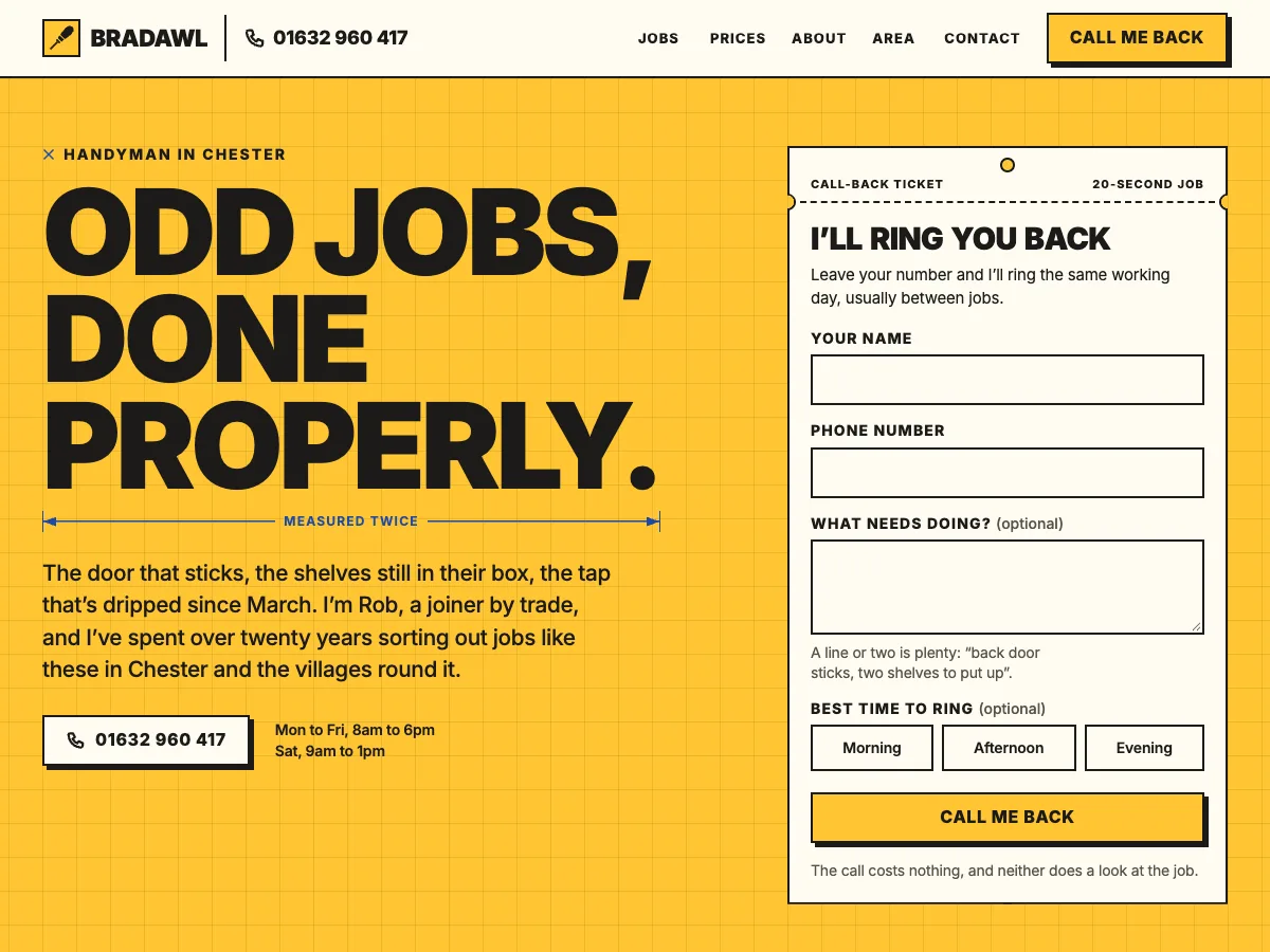
On a screen the brand has the least room and the most competition. The website opens with the logo and the number; everywhere smaller gets the mark.

The top of Bradawl’s website: the logo and phone number across the top, and the headline ‘Odd jobs, done properly.’ in heavy capitals on chalk blue.

The website

The logo and the number across the top, and chalk blue behind the headline. See the website

Profile picture

The bradawl on chalk blue, filling the square, and short enough that whichever way a site crops it, the whole of it is inside the circle.

Browser tab

The small mark again, at 16 pixels.

8. Do and don’t

Most of what goes wrong with a logo is somebody trying to help. A few rules, with pictures.